Shop
DreamUp AI Art
DreamUp
Join
Log In
User Menu
Upgrade to Core
Theme
Display Mature Content
Suppress AI Content
Get Help and Send Feedback
Terms of Service
Privacy Policy
Submit
Deviation
Submit your art
Upload your creations for people to see, favourite, and share.
DreamUp
Turn your dreams into reality
Generate your own AI work.
Status Update
Post an update
Tell the community what’s on your mind.
Journal
Post a journal
Share your thoughts, experiences, and stories behind the art.
Literature
Submit your writing
Upload stories, poems, character descriptions & more.
Subscription
Get your fans' support
Fund your creativity by creating subscription tiers.
psyfre on DeviantArt
https://www.deviantart.com/psyfre/art/Bodhidharma-65893622
psyfre
Deviation Actions
Add to Favourites
Comment
6
Favourites
Pic
Hugues24
$4
Buy It Now
Buy Exclusive
More by
psyfre
Watch
psyfre on DeviantArt
https://www.deviantart.com/psyfre/art/Dawn-18410442
psyfre
psyfre on DeviantArt
https://www.deviantart.com/psyfre/art/People-Sunset-158068645
psyfre
psyfre on DeviantArt
https://www.deviantart.com/psyfre/art/Haze-II-153323784
psyfre
psyfre on DeviantArt
https://www.deviantart.com/psyfre/art/Smoking-the-Edge-292498137
psyfre
psyfre on DeviantArt
https://www.deviantart.com/psyfre/art/Variant-264420777
psyfre
psyfre on DeviantArt
https://www.deviantart.com/psyfre/art/Deep-In-Mist-284388752
psyfre
psyfre on DeviantArt
https://www.deviantart.com/psyfre/art/Vibraphonspulen-273908960
psyfre
psyfre on DeviantArt
https://www.deviantart.com/psyfre/art/Trihedron-308287341
psyfre
psyfre on DeviantArt
https://www.deviantart.com/psyfre/art/Water-Rock-155579747
psyfre
Suggested Deviants
Coolhotcat
Watch
Coolhotcat on DeviantArt
Coolhotcat on DeviantArt
Coolhotcat on DeviantArt
Unbound-Curiosities
Watch
Unbound-Curiosities on DeviantArt
https://www.deviantart.com/unbound-curiosities/art/03116-23-07-24-Sdxl09-16365-974035647
Unbound-Curiosities
Unbound-Curiosities on DeviantArt
https://www.deviantart.com/unbound-curiosities/art/02995-23-07-24-Sdxl09-16175-974211993
Unbound-Curiosities
Unbound-Curiosities on DeviantArt
https://www.deviantart.com/unbound-curiosities/art/02335-23-07-24-Sdxl09-16271-973948515
Unbound-Curiosities
Suggested Collections
hinduism
In-Sine on DeviantArt
http://creativecommons.org/licenses/by-nc-nd/3.0/
https://www.deviantart.com/in-sine/art/Veerabhadra-462077601
In-Sine
sreeknaidu on DeviantArt
http://creativecommons.org/licenses/by-nc-nd/3.0/
https://www.deviantart.com/sreeknaidu/art/Lord-Sri-Krishna-197489190
sreeknaidu
Tika-estudio on DeviantArt
http://creativecommons.org/licenses/by-nc-nd/3.0/
https://www.deviantart.com/tika-estudio/art/Meenakshi-devi-804043118
Tika-estudio
Hindu
ch28 on DeviantArt
https://www.deviantart.com/ch28/art/Ganesha-851538680
ch28
mmmmmr on DeviantArt
https://www.deviantart.com/mmmmmr/art/Shiva-as-the-Sundareswarar-783798262
mmmmmr
RenjuArt on DeviantArt
https://www.deviantart.com/renjuart/art/Ganesh-Ruins-concept-528326254
RenjuArt
Buddhism
HaniSantosa on DeviantArt
https://www.deviantart.com/hanisantosa/art/May-all-beings-be-liberated-251672940
HaniSantosa
HOON on DeviantArt
https://www.deviantart.com/hoon/art/OKII-JIJIN-Ninja-Talkshow-28205819
HOON
Leki-Lily on DeviantArt
https://www.deviantart.com/leki-lily/art/Water-Lilies-383271574
Leki-Lily
You Might Like…
AIJunkyard on DeviantArt
Smai-Lee on DeviantArt
GreatStefan671 on DeviantArt
https://www.deviantart.com/greatstefan671/art/--296429182
GreatStefan671
PaulMeadows on DeviantArt
https://www.deviantart.com/paulmeadows/art/NightCafe-120523-25-1000367989
PaulMeadows
SabTheRat on DeviantArt
phoenixrising77Patty on DeviantArt
https://www.deviantart.com/phoenixrising77patty/art/Buddha-10-23-2022-934205907
phoenixrising77Patty
inwardscream on DeviantArt
https://www.deviantart.com/inwardscream/art/LOTUS-271344414
inwardscream
GiorgioQuePee8081 on DeviantArt
Boriseous on DeviantArt
https://www.deviantart.com/boriseous/art/Buddha-653302573
Boriseous
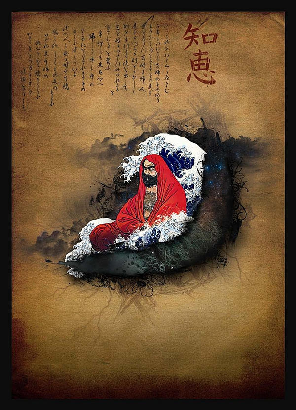
Bodhidharma
By
psyfre
Watch
Published:
Sep 27, 2007
16
Favourites
19
Comments
4.3K
Views
Description
"In this state of absorbed contemplation, there is no longer any question of holding an object in view; the vision is such that seeing and seen are one; object and act of vision have become identical."
Image size
652x900px 465.35 KB
© 2007 - 2024
psyfre
Comments
19
Join the community
to add your comment. Already a deviant?
Log In
spacethril
Jul 14, 2021
super
Reply
Load more